

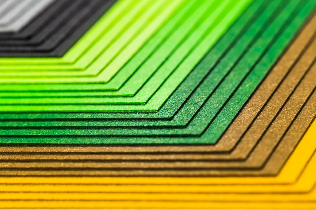
Colors are an essential part of human life. They keep us alive, gives a sense of freshness and have always made human life meaningful. We see colors all around us and most of us who either go to paint their house or works in a graphic field would know about the color wheel.
Sir Isaac Newton developed the first color wheel in 1666. Since then the wheel has been improvised, enhanced and varied numerous times by artists and scientist. The color wheel is distinguished into different color groups.
Color groups:
Colors have been improved a lot and modified into different types. This color theory is described in 3 types:
Primary colors:
The three colors derived from hues, who cannot be further mixed or formed with any combination of other colors. Such as Yellow, Red, and Blue.
Secondary Colors:
The second type is secondary colors, these are the colors that are formed by the mixture of primary colors. Such as Purple, Orange, and Green.
Tertiary Colors:
This third type of color is a mixture of primary and secondary colors, which is why the colors are two named such as red-violet, blue-green, and yellow-orange.
Warm Colors Vs Cool Color
According to the psychologists, colors have different psychological effects on our brain. The color wheel is categorized in sequence with colors being located with similar colors in a suitable position. These colors are then distributed into warm colors and cool colors according to their effect.
Warm colors:
We decide colors from the color pallets and use them according to their effects. Warm colors are originated from the idea of sun and fire. They provide feelings of warmth. They are considered to provide energizing, comforting, and inviting spirits. Such as red, yellow and orange.
Yellow
Yellow is a source of light and attracts attention. It stimulates the brain, which is a reason it is used as a warning sign when combined with black.
Yellow is also a sign of happiness, enjoyment, and entertainment. It alters the brain, increases focus and concentration and brain memory.
Red
Red is used as a warning sign and creates an alarming situation, which is a reason it is a dominant color. It helps to gain attention and has high impact. It brings feelings of excitement and happiness.
Red has been always associated with love, anger, and pain as well as energy and food.
Orange
Orange is an effective color, that boosts energy and refreshes the human brain. A more similar effect to what yellow color has, such as bringing positivity and optimism as well as high spirit.
Cool colors:
The other half of the color wheel that makes us feel calm, relax and in peace. They are blue undertones, the sky, ice, water, and grass. They provide soothing feelings. Such as blue, green, and purple.
Both tones of colors provide different effective effects on our brain. According to those effects we use these colors in graphic designing. They provide perception and depth to a design. The colors weather, warm or cold releases waves, such as red waves are longer than blues.
Mixing both tones or using them together we must focus on the contrast of temperature and controlling the intensity.
Blue
Blue is a lucid and balanced color. Brings calmness, coolness, and peace. Blue is associated with meditation, deepness, security, safety. As well as helps in brain development and improves concentration.
Green
Green is associated with growth and prosperity, provides a sense of security and relief as well. Green is used for logic and is linked to nature. It is soothing for the eyes as well as the brain.
Green is said to have an impact on language skills, artistic activities, dancing and cooking schools as it helps in learning.
Purple
Purple is a sign of luxury, wisdom, and creativity. It is formed with a mixture of Blue and Red. It also provides a sense of power and magic. Purple is said to have an effect of calmness and usually is used in home décor.
Purple used for brands shows, royalty and premium services as it used to be one of the most expensive colors to reproduce.
Neutral Colors
The mixture of both warm and cold colors gives us neutral colors. They are dull and clam colors. Neutral is not a part of the color wheel but is both cool and warm colors. Such as shades of browns, tans, golds, beige, and black, are usually considered to be warm neutrals, while shades of white, cream, ivory, gray, and silver are usually considered to be cool neutrals.
Types of Color a part of Web and Print Design
Colors are an essential part of a design. Whether its web, graphic or print design we need colors to enhance our designs. In Web and Print Design different types of colors are used from what is on the regular color wheel.
RGB Color
RGB colors are used in our computers and T.V sets. RGB is a combination of Red, Green and Blue, the primary colors. As we all know any color could be produced with the combination of these three colors. This type is based on light and light sources are doesn’t apply to print.
CMYK Color
The name CYMK stands for Cyan, Magenta, Yellow, and Black pigments. These four colors could be used to achieve any color, but less in comparison to RGB colors. This type is used for printers, especially in Newspaper printing.
Pantone (PMS) Spot Color
The last printing color method is PMS, stands for ‘Pantone Matching System’, created by Pantone Corporation. This type is created to replace CYMK colors, to make the colors pigments more refine and pure.
These spot colors are expensive but useful when the color is used on a minimum scale in design. PMS colors give a very specific color and always prints the same if once created. Based on a vast library of colors, updated yearly as well.
Psychological Effects of Warm and Cool Colors
As both colors are important, both have a different psychological effect on our brain and mood. Colors have a deep impact on our perception and we show a different reaction to different objects according to their color.
The combination of an effect of colors is used in graphic designing to create an impact on consumers. Such as advertisers often use warm colors to provide a sense of urgency, such as with red clearance signs, as well as optimism and joyfulness.
While cool colors have the opposite effects, as they provide a sense of calm and relaxation. The cool colors are used in designs to show a sense of health, tranquility, and wisdom. Blue, purple and green are used in marketing to carry a sense of trustworthiness and growth.
Create Balance with Colors
To create a design and use colors from all types, there should be a balance between the colors. If your design is warm and shows excitement, the warm color should show dominance. But if your design has elements of comfort and trust cool colors should lead the way.
In web designing, it is very important to work on a composed and balanced design, covering all important elements and contrast. To start a project, you need to consider the message you want to provide with the design you are designing.
Whether you are showing optimism, clarity or peace and strength. Knowing the difference between warm and cool colors is the first step.
Conclusion
Both groups of colors show variety and are an essential part of life as well as in designing. Colors could be used according to a person’s aesthetic sense and artistic appeal. Different shades evoke different effects on the human brain as well as on their moods.
If you’d like to read more about colors and web designs, read our blogs and comment below your suggestions.