Responsive website design is more than a modern trend; it’s a powerful solution that can enhance your online presence. Responsive design ensures your site looks and works correctly across devices, from smartphones to desktops, making it easier for users to get the results they want, stay longer on your site, and improve your search rankings. If you are wondering what the benefits of having a responsive site are, the answer lies in better user experience, higher search visibility, and improved business performance.
Do you want to Learn Why Responsive Design is a must for your business website? Read on to discover the main advantages, potential drawbacks, and what to consider before switching. Do you have questions or need expert guidance? Our team is here to help—contact us today!
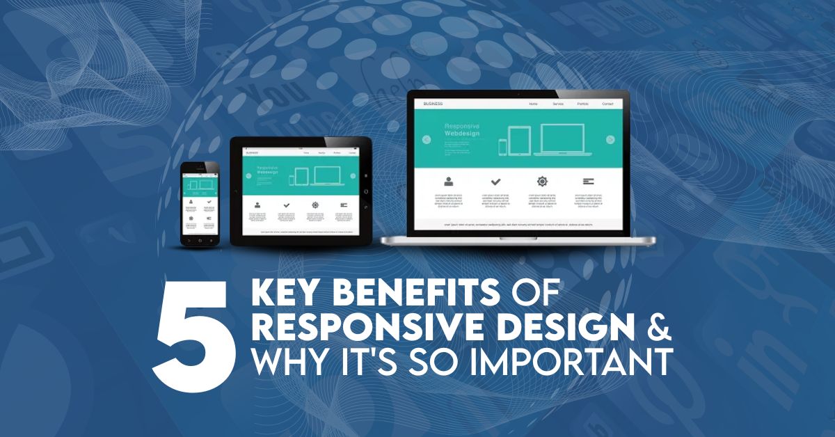
What Is Responsive Website Design?
The basics of Responsive design adapt the website layout to the device used. With responsive design, your website automatically adjusts its layout, images, and content to fit any smartphone, tablet, or desktop screen size. That gives your visitors the best viewing experience without extra zooming, scrolling, or resizing. In simple terms, responsive web design means creating a mobile-friendly website that works smoothly on every screen size.
Responsive design aims to provide an optimum experience across various devices. Your site needs to be mobile-friendly if you expect people to use it. Without a mobile-friendly experience, mobile users won’t be able to navigate your site, which is frustrating and can lead them to never come back, potentially losing a customer.
This clearly explains why a responsive website is important for both users and search engines. With responsive design, you do not need to create a separate mobile website. Building a single website that automatically adjusts to any screen and looks great is better than creating separate versions for desktop, mobile, and tablet.
Why is Responsive Website Design Important For Every Business?
Responsive design is vital for expanding your user base because it helps you reach smartphone and tablet users and provides a similar experience to desktop or laptop users. This seamless experience enhances engagement, lead generation, and conversions, and simplifies analytics and tracking by consolidating everything in one place.
One of the biggest advantages of responsive website design is that it allows businesses to reach users on all devices without losing quality or performance. This frees up your team by reducing the time and effort required to manage on-site content, saving you time and reducing costs. Currently, 44% of Fortune 500 companies are still not mobile-ready, so adopting responsive design will set you apart.
Businesses that invest in responsive web design often see better engagement, lower bounce rates, and higher conversions. While other mobile-friendly options, such as Dynamic Serving (same URL, different HTML/CSS) and separate mobile sites (different URLs for mobile users), exist, responsive design is Google’s recommended approach.
Google prefers responsive design because it improves crawling, indexing, and overall SEO performance. With more than 5.7 billion Google searches daily, your site must be optimized for mobile. You can see how your page stacks up with Google’s Mobile-Friendly Test tool to test whether your site is ready for mobile.
How to Create A Responsive Website Deisgn?
1. Define Your Responsive Strategy
First, identify who the users are and which devices they use. Determine breakpoints for different screen sizes, mobile, tablet, or desktop and prioritize design items accordingly.
This step helps ensure your responsive website delivers the best experience across all devices.
2. Plan Content and Layout
Prioritize your content and organize your hierarchy based on what users care about most on mobile.
A mobile-first approach is one of the key benefits of responsive web design because it focuses on user needs first.
3. Implement Fluid Grids and Flexible Layouts
Implement a fluid grid system that makes elements resize with flexible proportions.
Flexible layouts are essential for creating a mobile-friendly website that adapts smoothly to all screen sizes.
4. Adapt Design with Media Queries
Define breakpoints and adjust typography, spacing, and visibility for different devices.
Media queries play a major role in responsive design benefits by ensuring a consistent user experience.
5. Optimize Images and Media
Compress and scale images to improve loading time and performance.
Faster loading is another advantage of responsive websites that directly impacts SEO and user satisfaction.
6. Test and Debug
Test your website across devices and browsers to ensure smooth functionality.
Regular testing helps maintain the quality and performance of your responsive web design.
Why Responsive Design Is Essential for Your Website?
With the growth of multi-device usage, your website must work across all screen sizes. Over 64% of global internet traffic comes from mobile devices. This clearly shows why having a responsive site is important for reaching modern users. In fact, since 2015, mobile-friendliness has been part of Google’s ranking algorithm. If your site is not mobile-friendly, you may lose rankings, traffic, and potential customers.
Key Benefits Of Responsive Website Design
Now that we have discussed the importance of responsive website development, let’s examine some key benefits of responsive web design.
1. Cost Effectiveness
Maintaining two websites to serve desktop and mobile users is costly. With responsive design, your site is one, so you can stop investing in multiple versions of the same content and cater to all users with a single, fluid site.
One of the main benefits of having a responsive website is reduced development and maintenance costs.
2. Flexibility
When the site is responsive, you can make changes at breakneck speed; with every site version, you must make the same changes repeatedly. This allows us to save time and consistently deliver the same information across all platforms.
This flexibility is one of the major advantages of responsive design for growing businesses.
3. Enhanced User Experience
Also, having a responsive design makes your website compatible with any device that visitors use. Now that users no longer have to scroll endlessly or expand and collapse, they can easily navigate your site, which naturally leads to more engagement and enjoyment.
A better user experience is one of the top benefits of responsive web design and leads to higher engagement.
4. Improved SEO Performance
Search engines prefer responsive websites, especially Google, since mobile-friendly websites rank higher. Using responsive design increases your site’s visibility and naturally brings more traffic.
Responsive design benefits SEO by improving rankings, increasing traffic, and enhancing site performance.
5. Simplified Management
Having one responsive website makes it easier to update content, plan SEO, and run marketing campaigns. This combined approach minimizes administrative overhead and ensures a consistent brand image online.
This is why many businesses choose responsive website design for long-term efficiency and growth.
Understanding the Limitations of Responsive Design
Responsive design offers significant benefits; however, it also has limitations.
While discussing what are the benefits of having a responsive site, it is also important to understand its limitations.
Variable Display Across Devices: No website renders perfectly on every device. Translating complex layouts or designs can be challenging, which could affect the user experience.
Uniform Content Delivery: Responsive design often delivers identical content to all users, irrespective of device. It creates issues when creating experiences for different user cohorts or device classes.
Advertising Issues: Resizing advertisements, such as banner ads, across different screen sizes can affect display quality (e.g., blurry images, misaligned content) and compromise your advertising efforts.
Branding consistency: ensuring a unique design that aligns with the brand identity across devices can be challenging. Responsiveness needs flexibility, which would not allow the branding elements to be uniformly maintained.
However, even with the cons of responsive design, the pros tend to outweigh the cons. Mobile users represent a large market, and responsive design benefits them significantly.
Want to Give Your Website A Responsive Design?
With more than 60% of web traffic coming from mobile devices, your website must be responsive. Having a responsive website is no longer optional; it is essential for business success in today’s digital world. Not just a nice-to-have but a must-have in the digital world. When your site fits seamlessly on any device, these experiences translate into higher engagement and conversion rates through responsive design.
This is why we value a mobile-friendly online presence at Carbon Reprographics. Responsive design reduces costs by eliminating the need to create a separate website for each device. At the same time, it saves time because you only need to update one website to keep it current. This is one of the strongest advantages of responsive web design for businesses looking to grow online.
Browse Our Responsive Design Solutions
Ask about the cost involved in creating a responsive website. To learn more about us, head over to our Responsive Design Services page. You can also get a quote for your project by using our Web Design Calculator, designed for you.
Get a Free, Customized Quote
Ready to take the next step? Contact the design professionals at Carbon Reprographics to make your site more responsive. We will build a responsive website for your business that looks great, helps you achieve your business goals, and aligns with your brand.
FAQs: 5 Key Benefits of responsive website design and Why It’s So Important
Why Is Responsive Web Design So Important for Your Business?
Responsive web design is crucial for providing an optimal user experience across all devices. With over 60% of internet traffic coming from mobile devices, it’s essential for your website to be mobile-friendly to enhance user engagement, SEO performance, and conversion rates.
How Does Responsive Design Impact SEO?
Responsive design helps boost your SEO by ensuring your site is mobile-friendly, which is a ranking factor for Google. A responsive site means one URL and one set of content that search engines can crawl efficiently, improving your site’s chances of ranking higher.
Does a Responsive Website Cost More Than a Traditional One?
No, a responsive website can save you money in the long run. Instead of having separate mobile and desktop sites, you only need one version that adapts to all devices, reducing maintenance and development costs.
How Can I Test If My Website Is Mobile-Friendly?
Use Google’s Mobile-Friendly Test tool to check how well your site performs on mobile devices. It’s a simple and effective way to ensure your website meets the required mobile optimization standards.
What Are the Drawbacks of Responsive Design?
While responsive design offers many benefits, some limitations include potential display issues on various devices, the challenge of creating custom experiences for different devices, and difficulties in maintaining branding consistency across all screens.


 Powered by